top of page

Next Chapter Nutrition is a practice that specializes in disordered eating. They help you make confident, nourishing choices using a non-diet approach that helps lead you to living without restrictions.


The Challenge
Create a brand for a practice that specializes in disordered eating, focusing on a calm, relaxed, and approachable image. The brand should convey trust, empathy, and education while remaining warm and personable. The goal is to design a visual identity that makes clients feel supported, informed, and comfortable on their journey toward healing and wellness.


The Process
This design process focused on capturing the whimsical and calming feeling of nature, while also emphasizing the theme of inner growth. The creative journey included exploring various elements such as a rising sun and flourishing plants, all aimed at conveying a sense of tranquility and renewal.
Logo Brief
Next Chapter requested a logo that stands out from the usual medical designs. They envisioned something that conveys warmth and safety, while also appearing trustworthy and professional. Additionally, they wanted to highlight the natural aspect of their practice, which specializes in recovery without medication.
Final Design
We went for clean lines and soft colors to make the brand feel friendly and modern. This approach helps Next Chapter to stand out while still looking professional and trustworthy.


1/1
Colors & Typography
The color palette was built to create an organic and welcoming feel, while the font pairing brings a sense of maturity and trust. Together, the colors and typefaces balance tradition with modernity, creating an identity that feels credible, approachable, and safe.


Sage
Stone
Champagne
Evergreen
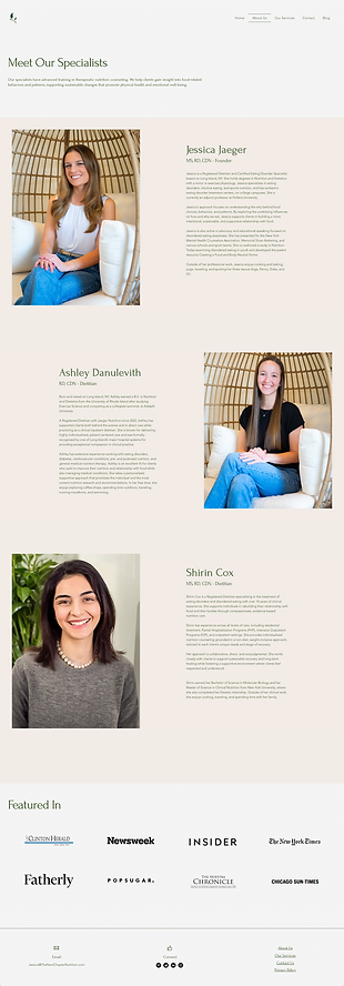
Website Screens
The site is intended to be warm, welcoming and inviting. The broader goal is to provide users with a sense of safety and comfort as they embark on their journey to a healthier life.



Additional Elements
I wanted to be sure that the branding could span across digital and physical spaces. Stress testing the colors, elements and type in different use cases helped to finalize the look and call the project complete.


1/1
bottom of page